• COMPETITIVE ANALYSIS:
- Cold Stone - Cold Stone is probably the first competitor I thought of after hearing about Oh Yeah!'s ice cream mixing. As expected of an international chain, their website is fairly glitzy and full of various web 2.0 and flash elements.
As with any modern, large-scale company website, Cold Stone's website seems to be in danger of being over overcrowded. The large scrolling flash element in the middle takes up a lot of any viewer's attention, which clashes with the bright-red background in terms of fighting for attention. The main page looks like it would benefit from some simplification, especially with regards to the two navigation bars (top nav bar including "Search this Site" and search bar, and bottom nav bar including main links), the footer (which, for some reason, isn't centered), and the three different sections in the middle, each with separate links.
As is the case with most company websites, Cold Stone seems to have shoved too many elements into one page in an attempt to captivate the viewer and shove as much information as possible into their face. And while the search bar, login system, and various social networking links do give a user much to do with the site, the front page could probably be pruned down a bit to give the website a slightly clearer hierarchy.
- Ben & Jerry's - Personally, I'm not a big fan of Ben & Jerry's, and am thus not that accustomed to the company's image. Judging by the website's seasonal Halloween frontpage and rainbow-colored navigation links, the website seems to be aimed at a younger audience. The flash animation on the front page is a bit distracting, especially because it starts playing sounds automatically and doesn't have a clear "Off"/"skip intro" button in sight.
The website does, at least, have a consistent layout and theme, and while there isn't much of a color palette (the website seems to like traversing the entire spectrum), everything is bright and kid-friendly, from font to layout to animations. There also seems to be a fairly clear hierarchy, with a main content box in the middle and a bunch of smaller menu boxes lining the top, left and bottom. The dripping-milk-borders seem to be a bit indulgent, but probably add to the site's general feel.
- Klavon's Authentic Ice Cream Parlor - Haha oh wow, this website is a trainwreck. Rather than relying on huge, national ice cream chains, I looked up ice cream parlors around Pittsburgh (more in the league of Oh Yeah! even if they're not in the same area) and came across the website for Klavon's, located in the Strip District. I've never been to Klavon's, but if the website is any indication, it sure lives up to its "1920's Ice Cream Parlor" title in that the website is immensely outdated.
The website seems to be a disorganized collection of links and widgets displayed in the fashion of those old "My First Website" messes that were littered around Angelfire and Geocities back in the day. There's no real layout or consistency, and the music automatically playing in the background probably serves to annoy more visitors than appeal to anyone.
The only good things I can honestly say about the website are that it at least has some pictures of the establishment (even if they're poorly presented). The automatic music, the animated .gifs, the overlapping of different images and elements, and various other factors suggest that this website was made a long time ago by someone without much consideration for the design and hasn't been updated since.
• USER PROFILES:
- Oh Yeah!
Age: All ages, mostly children up to middle-aged.
Gender: All genders.
Nationality: All nationalities.
Location: Pittsburgh, Shadyside.
Attitudes: A bit hipster, maybe geeky/bookish.
Beliefs: Somewhat casual, at least enough to make time for ice cream and waffles. A slight preference for geeky knick-knacks, old-fashioned decor, and/or free-trade/natural foods.
Interests: Ice cream, waffles, coffee, knick-knacks, kitshcy accessories and decorations, organic and/or free-trade food items.
Favorite Websites: Probably indépendant cafés, maybe sites for organic/free-trade foods. Foodie sites?
Lifestyle Information: Casual, eco-conscious.
Viewer Expectations of Their Website: Nothing too complicated, perhaps something with a menu, directions, and any new information.
Computer Skills: Medium. Capable of internet basics.
Computer Type: PC or Mac.
Browser Type: Computer defaults (IE, Safari) or Firefox.
Internet Connection Speed: Average.
- Cold Stone
Age: All ages, mostly children and younger adults.
Gender: All genders.
Nationality: All nationalities.
Location: International chain; various locations in Pittsburgh.
Attitudes: Somewhat preppy maybe, willing to pay for a big-name brand, sticking to what's familiar and famous.
Beliefs: Trust in big-name companies, wanting "the best," maybe.
Interests: Ice cream, unique preparation methods for food?
Favorite Websites: High lifestyle sites.
Lifestyle Information: Well-enough off, sticking to familiar brand names, but wanting what's trendy and special.
Viewer Expectations of Their Website: Probably high, given how much of a big-name Cold Stone is. Something classy and with lots of information about the ice cream and products available, as well as brand/company information.
Computer Skills: All across the board, probably a medium average.
Computer Type: PC or Mac.
Browser Type: Computer defaults (IE, Safari) or Firefox.
Internet Connection Speed: Need a fairly high speed connection to load the website quickly and efficiently. (Graphics & Flash components.)
- Ben & Jerry's
Age: All ages, but skewed more towards younger children.
Gender: All genders.
Nationality: All nationalities.
Location: International chain, two locations in Pittsburgh.
Attitudes: Casual, just wanting some ice cream, not attracted to anything that fancy. Kid-friendly, nothing too artificial or professional looking. Probably looking more for ice cream to have at home, rather than at a parlor.
Beliefs: Somewhat environmentally friendly. Fun and comfort.
Interests: Ice cream. Latest holiday & events, fair trade and/or organic/natural ingredients. Kid-friendly activities.
Favorite Websites: Fair trade/natural foods websites.
Lifestyle Information: Casual and comfortable, some environmental consciousness.
Viewer Expectations of Their Website: Fairly high, given Ben & Jerry's is a fairly big-name in the ice cream industry. Something highly informative, if not necessarily interactive. Maybe kid-friendly to distract any children.
Computer Skills: Medium average.
Computer Type: PC or Mac.
Browser Type: Computer defaults (IE, Safari) or Firefox.
Internet Connection Speed: Need a fairly high speed connection to load the website quickly and efficiently. (Graphics & Flash components.)
- Klavon's
Age: The much older crowd. Probably nearby students, people who want ice cream (teens to twenties), and then much older people who visit out of nosetalgia.
Gender: All genders.
Nationality: Probably more born-and-raised Americans, as the place boasts 1920's tradition.
Location: Pittsburgh, Strip District.
Attitudes: Nostalgic, and/or curious about the "previous generations." Kitschy and a bit gimmicky.
Beliefs: Longing for the past?
Interests: Ice cream, obviously. Old-fashioned ice cream parlors & soda fountains, drugstores. Maybe historical locations.
Favorite Websites: Difficult to say; the older patrons probably wouldn't use computers that much in the first place.
Lifestyle Information: Casual and modern, especially if one would visit the parlor for the nostalgia factor.
Viewer Expectations of Their Website: Nothing too high, probably something basic with a menu, map, and any information pertaining to the store's opening/closing.
Computer Skills: Not that good, especially for the older generation.
Computer Type: Most likely PC.
Browser Type: IE.
Internet Connection Speed: Average.
• Social Media Audit
- The use of twitter for store-related events is good (airline alternative talk, movies on show, Bring Your Own Cup), but unrelated tweets (BP talk, insurance question, etc.) should probably be trimmed down in order to keep the Twitter account relevant as much as possible. Maybe a separate twitter account or tag for movie-related announcements, if those are common, as well as a focus on different flavors that staff or customers recommend, since much of Oh Yeah!'s appeal seems to lie in customization.
- Flickr would probably be helpful, especially because the store has such strong visual appeal (unique decor, busy counter, lots of items on display). Something like asking customers to send in photographs of themselves and/or their orders in the store, and the author of the best photograph of the month wins a free scoop might encourage people to submit photographs, which would also be free publicity towards people looking for a snack around Pittsburgh. (This could also work on Facebook.)
- Facebook seems to be the standard for any company wanting publicity lately. Announcing any events (e.g. the DJ visiting, special discounts) on Facebook would probably draw more attention than purely on Twitter, since many people are connected to events through Facebook. A similar photo-contest/raffle as suggest for Flickr could be used for Facebook (or maybe the same contest could be held across both Flickr and Facebook, for a larger user pool).
• Method of Building the Site (Dreamweaver / CSS)
HTML is the basis of the website, while CSS is the fancy layout and decorations, in most cases. It's something like with a cake: the HTML would be the batter and cake body, while the CSS is the frosting, piping, and candles. By applying the same CSS to different HTML pages, one can keep a consistent layout and style between various pages while changing the content.
The current website design has a very simple CSS that designates only the background image (which is, in effect, the entire page, for most of the website) and a map of links for the "Ice Cream," "Coffee," "Waffles!," "Movie Nights" and "Library." Because each page requires a unique background image with all of the text as part of the image, pages are difficult to both make and edit.
The new website layout I've created has a very simple HTML structure customized with a seperate CSS page. This way, it would be possible to create new pages by imitating the pre-existing pages' HTML structure, and the CSS would do all of the complicated layout adjustment on its own.
Dreamweaver is a program that translates CSS programming into a visual format, to make it easier for designers to adjust the various elements without having to dig through large amounts of pure code. It exports everything as .html and .css files, so there are no compatibility issues. All files made with Dreamweaver can be opened with other, simpler programs like Notepad in order to edit the html.
• Testing Audience
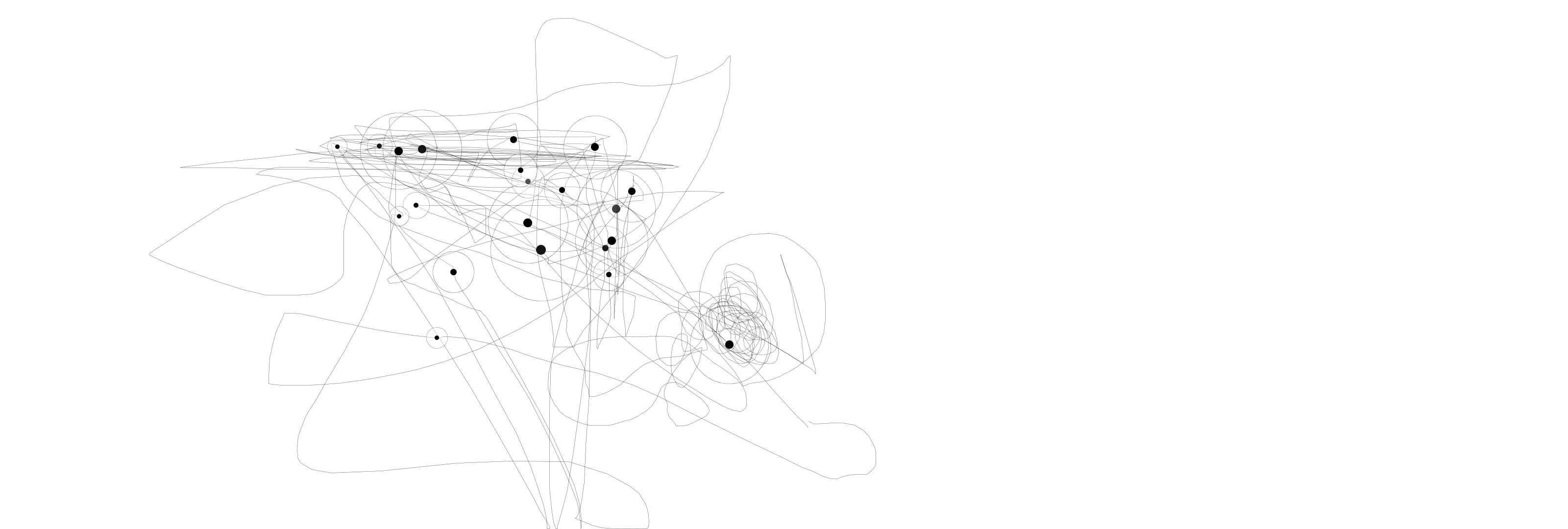
[ ONE ] (the dimensions of this look strange because the right-side half is an additional monitor that was not in use while iograph was running.)
[ TWO ]
[ THREE ]
[ FOUR ]
[ FIVE ]
- Cold Stone - Cold Stone is probably the first competitor I thought of after hearing about Oh Yeah!'s ice cream mixing. As expected of an international chain, their website is fairly glitzy and full of various web 2.0 and flash elements.
As with any modern, large-scale company website, Cold Stone's website seems to be in danger of being over overcrowded. The large scrolling flash element in the middle takes up a lot of any viewer's attention, which clashes with the bright-red background in terms of fighting for attention. The main page looks like it would benefit from some simplification, especially with regards to the two navigation bars (top nav bar including "Search this Site" and search bar, and bottom nav bar including main links), the footer (which, for some reason, isn't centered), and the three different sections in the middle, each with separate links.
As is the case with most company websites, Cold Stone seems to have shoved too many elements into one page in an attempt to captivate the viewer and shove as much information as possible into their face. And while the search bar, login system, and various social networking links do give a user much to do with the site, the front page could probably be pruned down a bit to give the website a slightly clearer hierarchy.
- Ben & Jerry's - Personally, I'm not a big fan of Ben & Jerry's, and am thus not that accustomed to the company's image. Judging by the website's seasonal Halloween frontpage and rainbow-colored navigation links, the website seems to be aimed at a younger audience. The flash animation on the front page is a bit distracting, especially because it starts playing sounds automatically and doesn't have a clear "Off"/"skip intro" button in sight.
The website does, at least, have a consistent layout and theme, and while there isn't much of a color palette (the website seems to like traversing the entire spectrum), everything is bright and kid-friendly, from font to layout to animations. There also seems to be a fairly clear hierarchy, with a main content box in the middle and a bunch of smaller menu boxes lining the top, left and bottom. The dripping-milk-borders seem to be a bit indulgent, but probably add to the site's general feel.
- Klavon's Authentic Ice Cream Parlor - Haha oh wow, this website is a trainwreck. Rather than relying on huge, national ice cream chains, I looked up ice cream parlors around Pittsburgh (more in the league of Oh Yeah! even if they're not in the same area) and came across the website for Klavon's, located in the Strip District. I've never been to Klavon's, but if the website is any indication, it sure lives up to its "1920's Ice Cream Parlor" title in that the website is immensely outdated.
The website seems to be a disorganized collection of links and widgets displayed in the fashion of those old "My First Website" messes that were littered around Angelfire and Geocities back in the day. There's no real layout or consistency, and the music automatically playing in the background probably serves to annoy more visitors than appeal to anyone.
The only good things I can honestly say about the website are that it at least has some pictures of the establishment (even if they're poorly presented). The automatic music, the animated .gifs, the overlapping of different images and elements, and various other factors suggest that this website was made a long time ago by someone without much consideration for the design and hasn't been updated since.
• USER PROFILES:
- Oh Yeah!
Age: All ages, mostly children up to middle-aged.
Gender: All genders.
Nationality: All nationalities.
Location: Pittsburgh, Shadyside.
Attitudes: A bit hipster, maybe geeky/bookish.
Beliefs: Somewhat casual, at least enough to make time for ice cream and waffles. A slight preference for geeky knick-knacks, old-fashioned decor, and/or free-trade/natural foods.
Interests: Ice cream, waffles, coffee, knick-knacks, kitshcy accessories and decorations, organic and/or free-trade food items.
Favorite Websites: Probably indépendant cafés, maybe sites for organic/free-trade foods. Foodie sites?
Lifestyle Information: Casual, eco-conscious.
Viewer Expectations of Their Website: Nothing too complicated, perhaps something with a menu, directions, and any new information.
Computer Skills: Medium. Capable of internet basics.
Computer Type: PC or Mac.
Browser Type: Computer defaults (IE, Safari) or Firefox.
Internet Connection Speed: Average.
- Cold Stone
Age: All ages, mostly children and younger adults.
Gender: All genders.
Nationality: All nationalities.
Location: International chain; various locations in Pittsburgh.
Attitudes: Somewhat preppy maybe, willing to pay for a big-name brand, sticking to what's familiar and famous.
Beliefs: Trust in big-name companies, wanting "the best," maybe.
Interests: Ice cream, unique preparation methods for food?
Favorite Websites: High lifestyle sites.
Lifestyle Information: Well-enough off, sticking to familiar brand names, but wanting what's trendy and special.
Viewer Expectations of Their Website: Probably high, given how much of a big-name Cold Stone is. Something classy and with lots of information about the ice cream and products available, as well as brand/company information.
Computer Skills: All across the board, probably a medium average.
Computer Type: PC or Mac.
Browser Type: Computer defaults (IE, Safari) or Firefox.
Internet Connection Speed: Need a fairly high speed connection to load the website quickly and efficiently. (Graphics & Flash components.)
- Ben & Jerry's
Age: All ages, but skewed more towards younger children.
Gender: All genders.
Nationality: All nationalities.
Location: International chain, two locations in Pittsburgh.
Attitudes: Casual, just wanting some ice cream, not attracted to anything that fancy. Kid-friendly, nothing too artificial or professional looking. Probably looking more for ice cream to have at home, rather than at a parlor.
Beliefs: Somewhat environmentally friendly. Fun and comfort.
Interests: Ice cream. Latest holiday & events, fair trade and/or organic/natural ingredients. Kid-friendly activities.
Favorite Websites: Fair trade/natural foods websites.
Lifestyle Information: Casual and comfortable, some environmental consciousness.
Viewer Expectations of Their Website: Fairly high, given Ben & Jerry's is a fairly big-name in the ice cream industry. Something highly informative, if not necessarily interactive. Maybe kid-friendly to distract any children.
Computer Skills: Medium average.
Computer Type: PC or Mac.
Browser Type: Computer defaults (IE, Safari) or Firefox.
Internet Connection Speed: Need a fairly high speed connection to load the website quickly and efficiently. (Graphics & Flash components.)
- Klavon's
Age: The much older crowd. Probably nearby students, people who want ice cream (teens to twenties), and then much older people who visit out of nosetalgia.
Gender: All genders.
Nationality: Probably more born-and-raised Americans, as the place boasts 1920's tradition.
Location: Pittsburgh, Strip District.
Attitudes: Nostalgic, and/or curious about the "previous generations." Kitschy and a bit gimmicky.
Beliefs: Longing for the past?
Interests: Ice cream, obviously. Old-fashioned ice cream parlors & soda fountains, drugstores. Maybe historical locations.
Favorite Websites: Difficult to say; the older patrons probably wouldn't use computers that much in the first place.
Lifestyle Information: Casual and modern, especially if one would visit the parlor for the nostalgia factor.
Viewer Expectations of Their Website: Nothing too high, probably something basic with a menu, map, and any information pertaining to the store's opening/closing.
Computer Skills: Not that good, especially for the older generation.
Computer Type: Most likely PC.
Browser Type: IE.
Internet Connection Speed: Average.
• Social Media Audit
- The use of twitter for store-related events is good (airline alternative talk, movies on show, Bring Your Own Cup), but unrelated tweets (BP talk, insurance question, etc.) should probably be trimmed down in order to keep the Twitter account relevant as much as possible. Maybe a separate twitter account or tag for movie-related announcements, if those are common, as well as a focus on different flavors that staff or customers recommend, since much of Oh Yeah!'s appeal seems to lie in customization.
- Flickr would probably be helpful, especially because the store has such strong visual appeal (unique decor, busy counter, lots of items on display). Something like asking customers to send in photographs of themselves and/or their orders in the store, and the author of the best photograph of the month wins a free scoop might encourage people to submit photographs, which would also be free publicity towards people looking for a snack around Pittsburgh. (This could also work on Facebook.)
- Facebook seems to be the standard for any company wanting publicity lately. Announcing any events (e.g. the DJ visiting, special discounts) on Facebook would probably draw more attention than purely on Twitter, since many people are connected to events through Facebook. A similar photo-contest/raffle as suggest for Flickr could be used for Facebook (or maybe the same contest could be held across both Flickr and Facebook, for a larger user pool).
• Method of Building the Site (Dreamweaver / CSS)
HTML is the basis of the website, while CSS is the fancy layout and decorations, in most cases. It's something like with a cake: the HTML would be the batter and cake body, while the CSS is the frosting, piping, and candles. By applying the same CSS to different HTML pages, one can keep a consistent layout and style between various pages while changing the content.
The current website design has a very simple CSS that designates only the background image (which is, in effect, the entire page, for most of the website) and a map of links for the "Ice Cream," "Coffee," "Waffles!," "Movie Nights" and "Library." Because each page requires a unique background image with all of the text as part of the image, pages are difficult to both make and edit.
The new website layout I've created has a very simple HTML structure customized with a seperate CSS page. This way, it would be possible to create new pages by imitating the pre-existing pages' HTML structure, and the CSS would do all of the complicated layout adjustment on its own.
Dreamweaver is a program that translates CSS programming into a visual format, to make it easier for designers to adjust the various elements without having to dig through large amounts of pure code. It exports everything as .html and .css files, so there are no compatibility issues. All files made with Dreamweaver can be opened with other, simpler programs like Notepad in order to edit the html.
• Testing Audience
[ ONE ] (the dimensions of this look strange because the right-side half is an additional monitor that was not in use while iograph was running.)
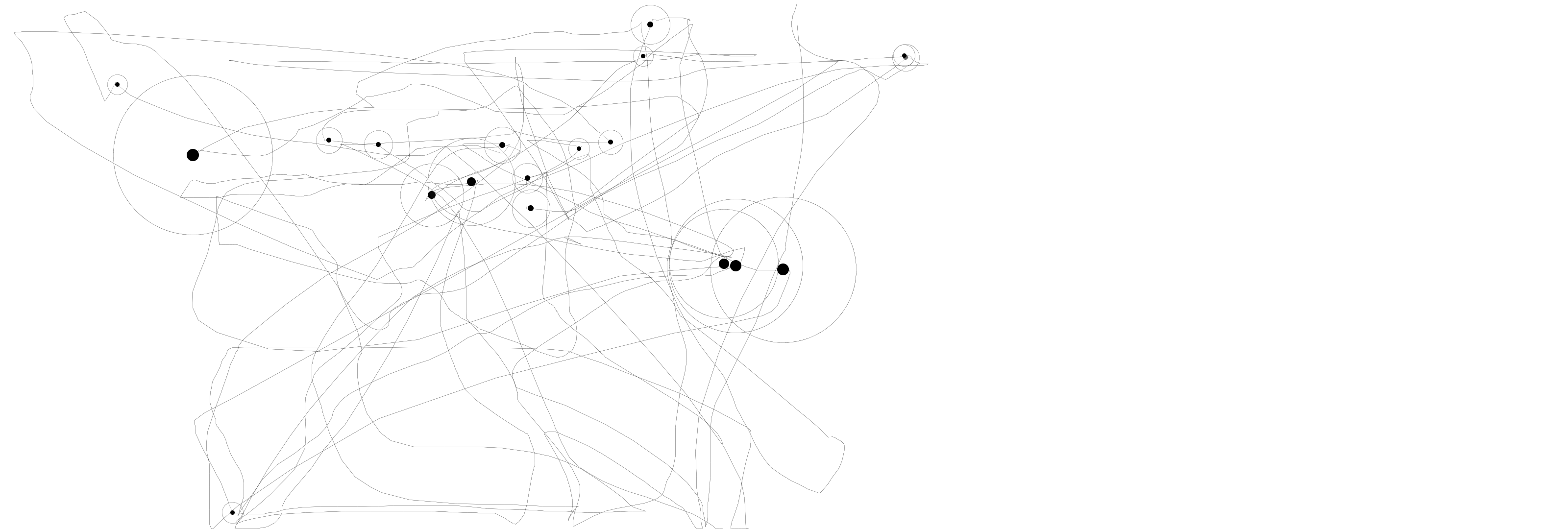
[ TWO ]
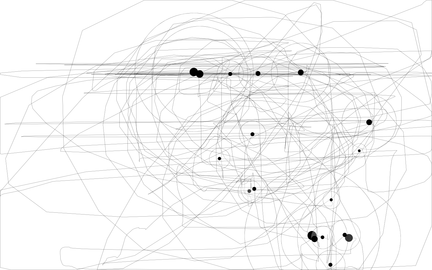
[ THREE ]
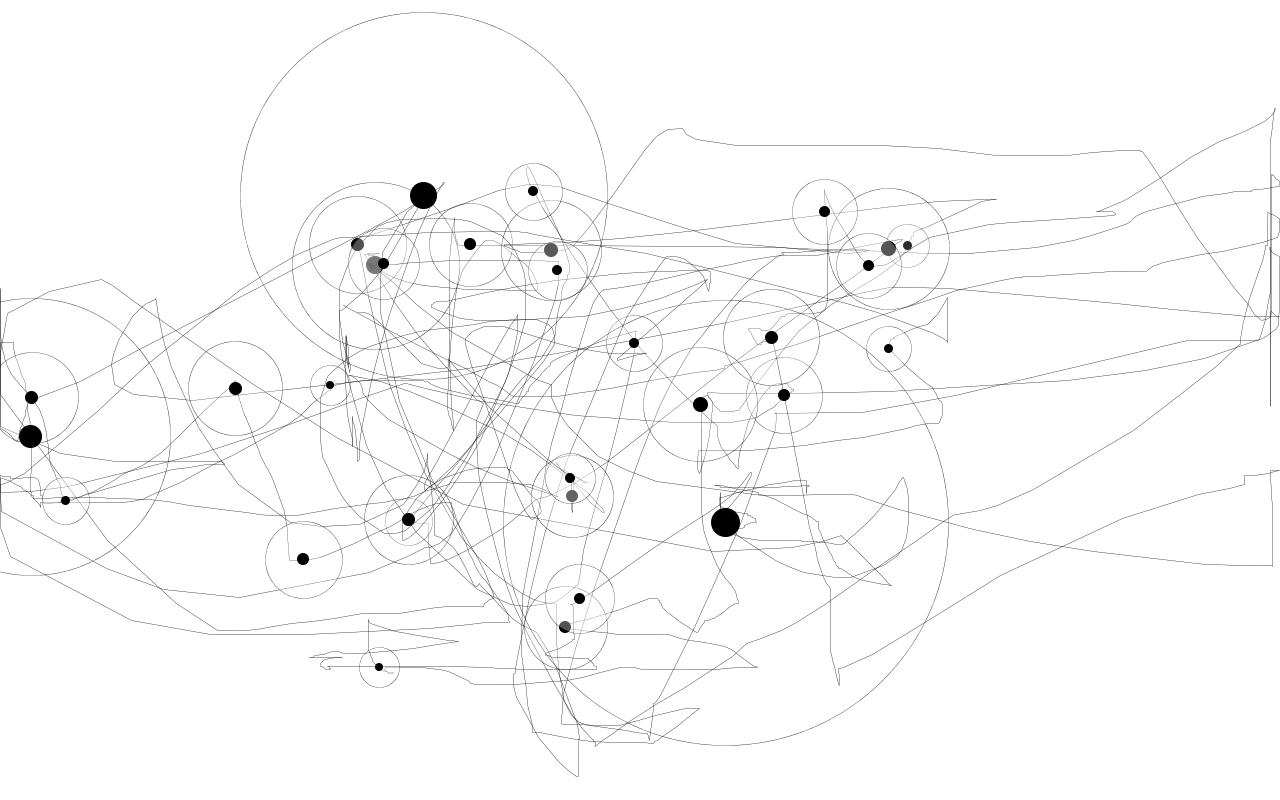
[ FOUR ]
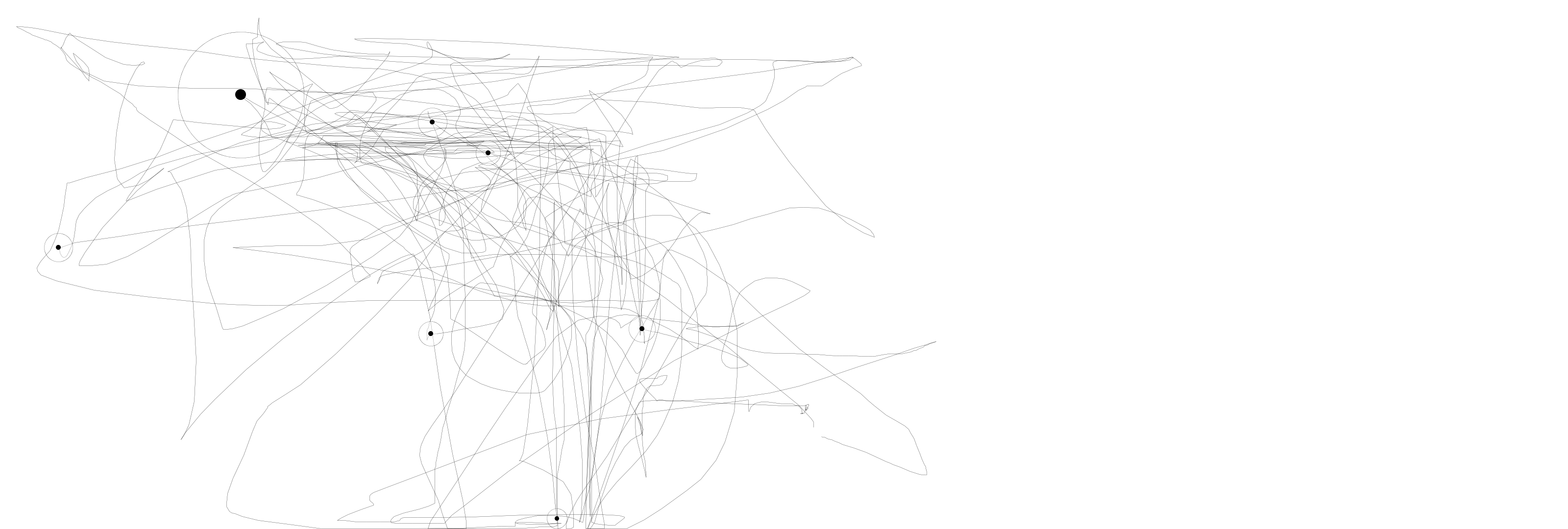
[ FIVE ]